Bom Dia
Brand design
Strategy
Naming
Illustration
Packaging design
Logo design
2025 Wine Enthusiast Brand Innovator Nomination500+ Doors in less than 12 monthsA true partnership from the start, Brazil’s largest winery wanted to introduce the American consumer to the relatively unknown idea of Brazilian wine and wanted to do it by disrupting the blur of indistinguishable European bottles on the sparkling shelf. With a deep dive into strategy we quickly found that many Americans were largely unfamiliar with Brazil beyond the highlights of Carnival, Rio, and beautiful beaches. So instead of fighting these stereotypes we chose to embrace them as a means to boldly convey our origins and uniqueness within the category.
With this strategic plan, we then explored names that would help us embody the sensuality and allure we wanted for the brand and ultimately landed on Bom Dia – meaning “Good Day” in Portuguese as well as being known as a flirty phrase for the morning after.
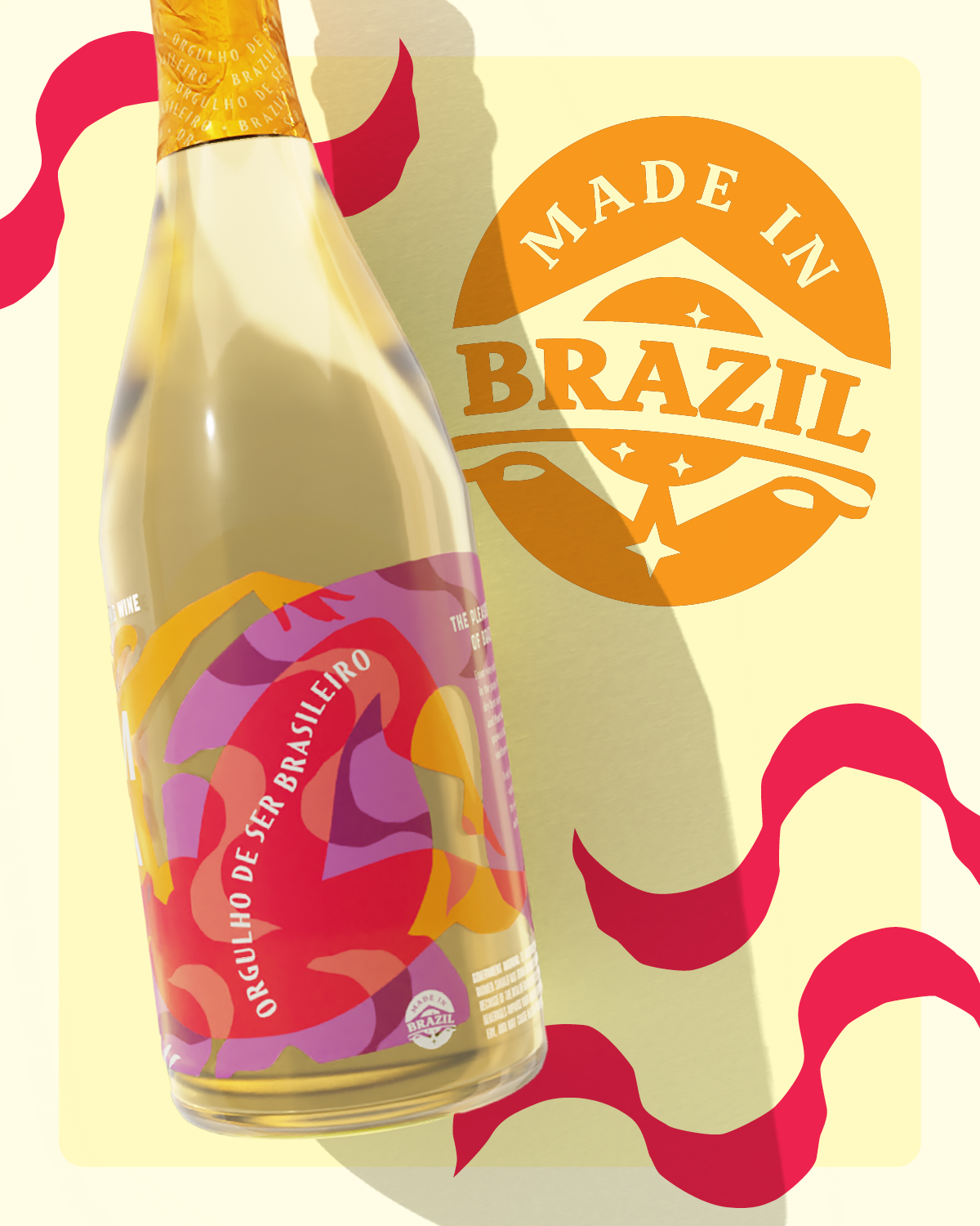
The visual identity we created also strategically breaks through category convention. Bold, graphic shapes form the bright figures of our Carnival dancer and jaguar that overlap and intertwine, wrapping and repeating around the bottle – epitomizing, and expanding upon, the American perception of Brazil. Together, their motion jostles the overlaid and interwoven content with a bubbly bounce like the effervescence inside. The wavy type on the foil cap, along with the wavy graphic pattern we use throughout the system, is a reference to the iconic wave mosaics of Rio's boardwalk. The entire design seeks to convey the sensuality, joy, and vibrancy of Brazil.
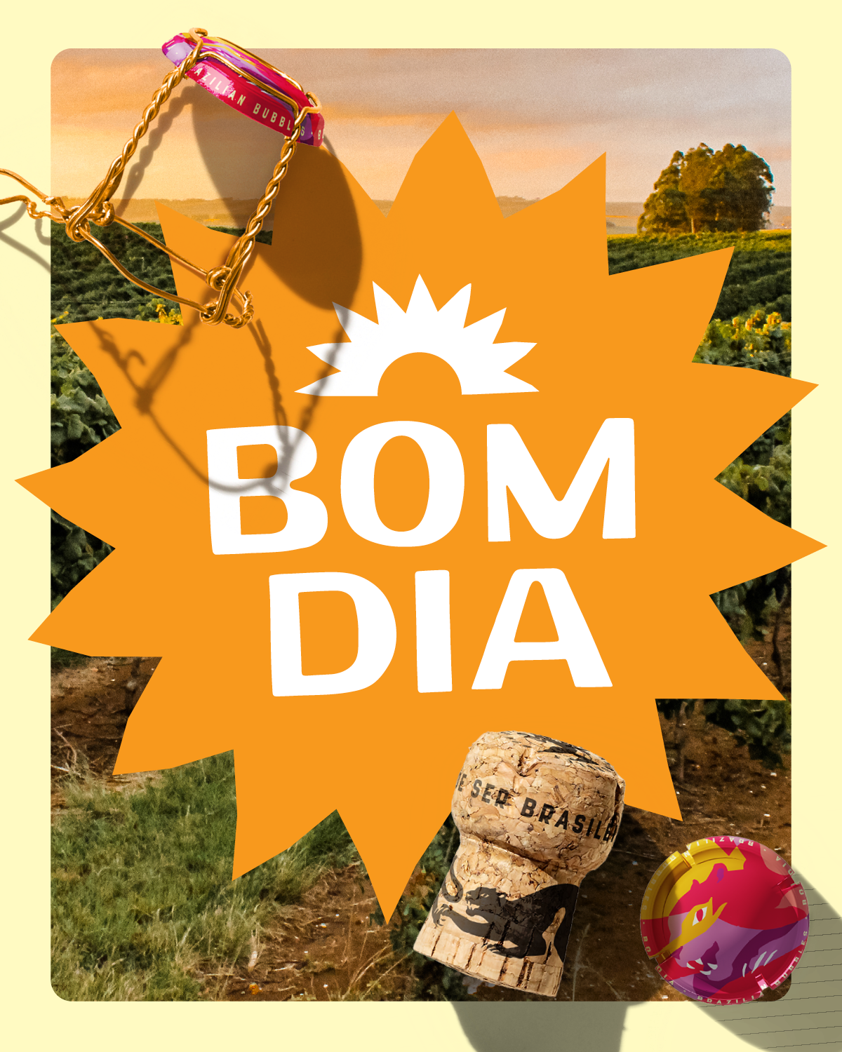
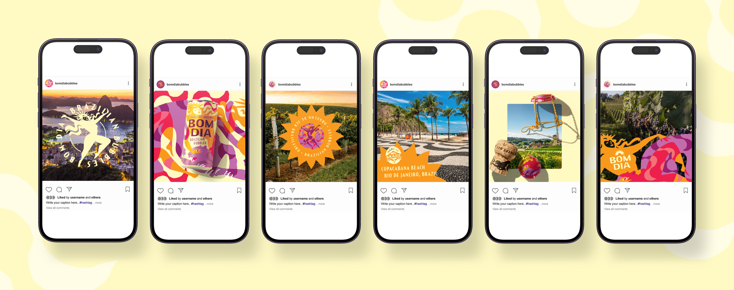
The system also extends beyond bottles to custom corks, branded wine cages and crowns, cans (in a new-to-the-US size), 4-pack cartons, point-of-sale displays, social media templates, bright business cards, and a vibrant website, all working together to bring the pleasures of Brazil to America shores and shelves.


